The Second Screen: Why the Click You Paid For Dies on Your Landing Page
By Jon Roland · July 12, 2026
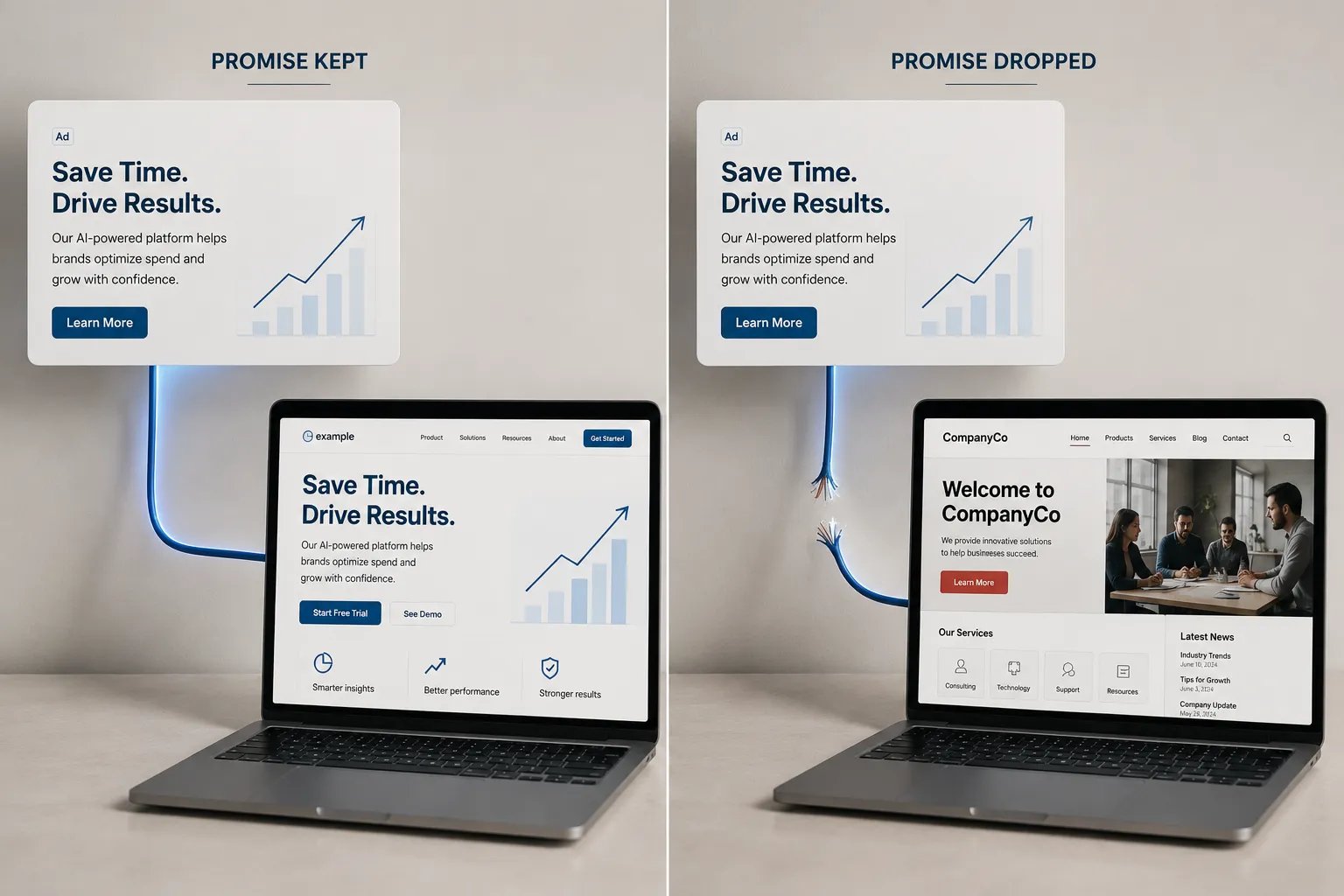
The click is the part you actually pay for. Every earlier stage of a Google Ads campaign is you getting ready to buy that click, and the moment someone taps your ad, the money leaves your account whether they buy or not. So the screen they land on next is not just a web page. It is the most expensive real estate you own. And on most small business accounts, it is where the sale quietly slips away.
The first three posts in this series were about earning that click. We covered why ads stop converting, the silent objections that stop a buyer mid-scroll, and how to stop paying for the wrong searches. Say you did all of it right. The right buyer typed the right search, read a sharp ad, and clicked. You paid for that click. Now they are looking at your landing page, and you have about five seconds before they decide to stay or hit the back button.
Here are the three ways that page loses a sale the ad already won.
1. The page does not finish the sentence the ad started
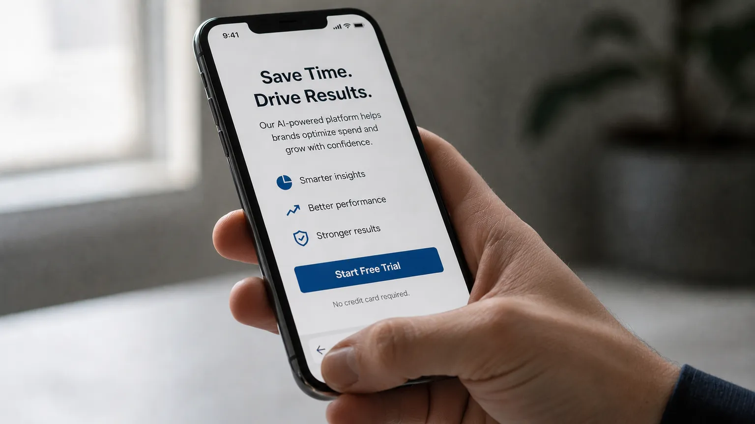
Post one called this message mismatch and gave it a paragraph. It earns a whole section here, because it is the most common way paid clicks die. The ad makes a specific promise. The page has to keep it, instantly, in the first thing the visitor sees.
The classic mistake is sending ad traffic to your homepage. Your ad said "Same-Day AC Repair in Houston." The click lands on a homepage with a photo slider, a company history, a menu of nine services, and the phone number somewhere near the bottom. The promise that earned the click has vanished, and the visitor has to go hunting for it. Most will not. They assume they are in the wrong place and leave.
What to do: run the five-second test. Land on your own page as the person who just clicked and ask, does the first screen repeat the exact promise the ad made? The headline should echo the ad's words. If the ad said same-day, the page headline says same-day and the button says "Book My Same-Day Visit," not "Submit." The click and the page should read like one sentence spoken by one voice, not a promise followed by a shrug.
2. The page asks for too much before it earns anything
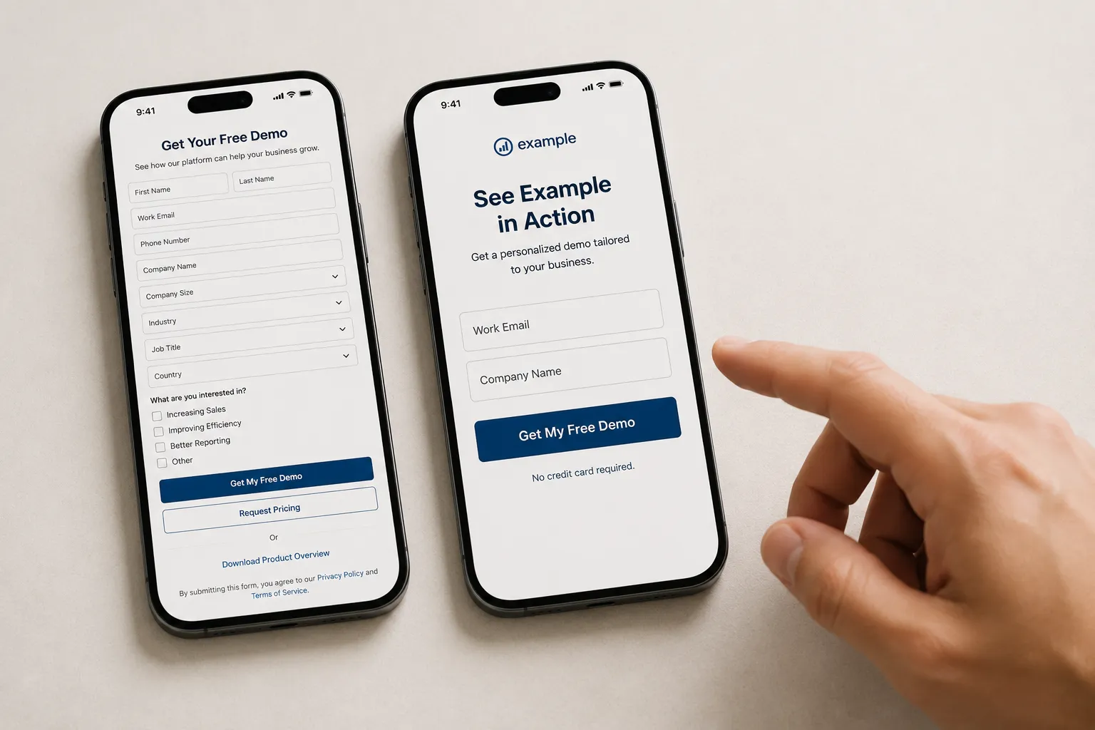
A buyer arrives ready to take one small step. Too many landing pages answer that willingness by demanding a lot: a nine-field contact form, a "call during business hours" note when it is currently 9pm, three competing buttons, and a wall of text between the visitor and the thing they came to do. Every extra field, every extra choice, every extra second of confusion is a reason to quit, and quitting is free for them and expensive for you.
Friction is not one big wall. It is a hundred small ones. The form that asks for a fax number. The forced account signup before a simple quote. The mobile page where the button sits below three scrolls of copy. Each one shaves a little off your conversion rate, and together they can cut it in half without anyone noticing, because a bounce leaves no note.
What to do: give the page one job and remove everything that does not serve it. One promise, one primary action, one button repeated where it makes sense. Cut the form to the fewest fields you truly need. Often a name and a phone number is enough to start a conversation. If a field does not change whether you can help someone, it should not stand between them and help.
3. The page gives them no reason to trust it right there
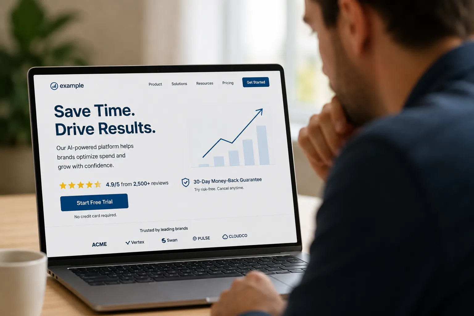
The ad earned the click. The page has to earn the action, and a stranger who just arrived has no reason yet to believe you. If the first screen is all claims and no evidence, the buyer's guard goes up at the exact moment you need it down.
This is the same trust problem from the silent objections post, now playing out on the page instead of the ad. "Quality service you can count on" is you talking about yourself. "Rated 4.9 from 380 Houston customers" and "Upfront pricing, you approve the cost before we start" are other people and hard facts talking for you. Proof placed right where the decision happens, next to the button and above the fold, is what turns a cautious visitor into a lead.
What to do: put your strongest evidence where the action is. A real rating and review count, a specific guarantee, a concrete number like an average response time, positioned so the buyer sees it in the same glance as the button. Do not make them scroll to the bottom to find the reason to trust you. By then they are already gone.
The pattern behind all three
Every one of these is the page forgetting what it inherited. The ad made a promise. The click was the buyer saying "alright, show me." And the landing page has one job: deliver that promise in the first screen, fast, with nothing in the way and proof in plain sight. When it does not, the most expensive moment in your whole campaign, the paid click, produces nothing.
That is why CouncilAds does not stop at the ad. Before you spend, it runs your ad past a council of 12 buyer personas modeled on real small business buyer psychology, from the price-sensitive skeptic to the ready-to-buy decision maker. Then it can run your landing page past that same kind of panel in ad-click mode, personas who have already clicked and are deciding whether to convert, and show you where the promise breaks, where the friction sits, and what would keep them on the page. You get to fix the second screen while it is still free to fix.
If you want more breakdowns like this, you can Add CouncilAds as a Google Preferred Source on Google at https://google.com/preferences/source?q=councilads.com. That way our Council Notes show up when you are searching for real answers about your ads.
You paid full price for the click. Do not give it away on the very next screen. Match the promise, clear the path, and show the proof before you fund it.
Ready to see where your landing page loses the click you paid for? Test your ad free at councilads.com.