Your Ad Did Its Job. Your Landing Page Didn't.
By Jon Roland · August 27, 2026

You already know the click was good. The ad is sharp, the search terms are right, the person clicking is the person you want, and you are still not booking the work. So the finger points at the page, because the page is the last thing standing between a good click and a paying job. Fair enough. But before you tear it apart, it is worth being sure the page is actually where the money leaks out, and not the thing that just gets blamed first because it is the easiest to see.
This is the fourth in the series, and it is the one that picks up the exact moment after the click. Post one gave the landing page a single section. On most small accounts it deserves the whole post, so here it is: how to tell if the page is really the problem, and the handful of things that quietly kill the sale even on pages that look fine.
First, make sure the page is even the leak

The page takes the blame for a lot of sins that belong somewhere else. Sort it out before you rebuild anything, or you will spend a weekend fixing the wrong thing.
Read your own numbers first. If people land and leave inside a few seconds without scrolling, that points at the page or the match. If they scroll, read, maybe even start the form and then bail, the page held them fine, and your problem is usually the offer or the price, not the layout. If your click-through rate looks great but the search terms behind those clicks are junk, that is targeting, and no page on earth saves a click from the wrong person. And if the ad promises one thing but pulls in people who wanted something else, that is the ad copy writing a check the page was never going to cash.
So the quick version: instant bounces mean page or match, long sessions with no lead mean offer, wrong searches mean targeting. Nail down which one you are actually looking at. The rest of this post is for when the answer is the page.
The one test that catches the most common page problem
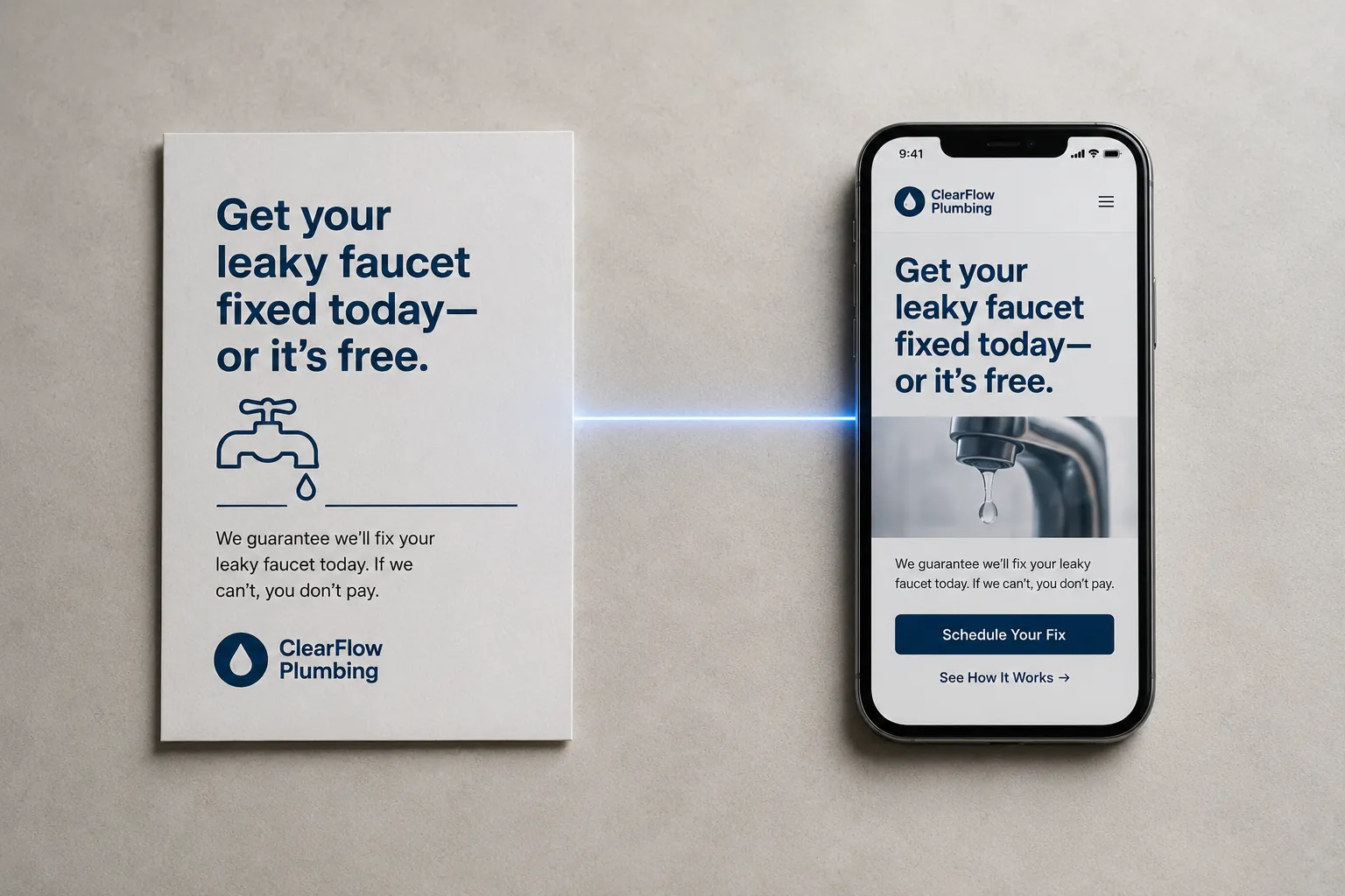
Pull up your ad and the page it points to, side by side, on the same screen. Now read them out loud, in order, like one sentence. Does the page say back the exact thing the ad promised, or does it change the subject?
This is ad to landing page match, and it is the leak I see most on otherwise solid accounts. The ad said "Same-Day AC Repair, Houston." A ready buyer clicks holding that one thought. If the page headline says anything other than same-day AC repair in Houston, first and big, you have quietly asked that buyer to translate. Not the same topic. The same words. A motivated person at 9 dollars a click does not translate. They hit back, and you paid for a bounce.
The test is not whether the page is good. It is whether the page is the same conversation the ad started. If it is not, fix the headline before you touch anything else. It is the cheapest, highest-return change on this whole list.
What kills the sale on pages that look fine
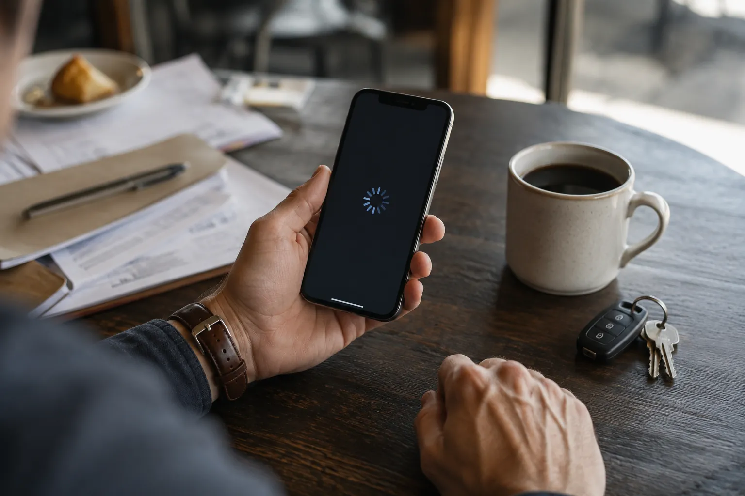
Say the match is tight and the page looks clean in your browser. It can still leak, and here are the usual suspects, roughly in the order they cost you money.
Load speed. Every second past about three drops conversions, and half your paid traffic is on a phone on cell service, not your fast office wifi. If the page takes five seconds to paint on a real phone, a chunk of your best buyers leave before they ever see it. Test it on your actual phone, off wifi.
Mobile friction. The page looks great on your monitor and it is a mess in a hand: tiny tap targets, a form field that zooms sideways, a button three thumb-scrolls down. Most of your clicks are mobile. If you are judging the page on a desktop, you are grading the wrong test.
A CTA nobody is sure about. If a stranger cannot tell in two seconds exactly what happens when they tap the button, that is a leak. "Submit" and "Learn More" ask for nothing. "Book My Same-Day Visit" tells them what they get. One clear action, worded the same way top and bottom.
Form length. Every field you ask for costs you replies. If a ready buyer has to give you name, email, phone, address, service type, budget, and how they heard about you before they can raise their hand, most will not bother. Ask for the least you need to start a conversation. Get the rest on the call.
Missing trust signals. Someone about to hand you their phone number and their money wants a reason to believe you are real. No rating, no reviews, no real photos, no license number, no address, and the careful buyers, the good ones, walk. The proof does not have to shout. It has to be there and easy to find.
Stop guessing. Test the page.
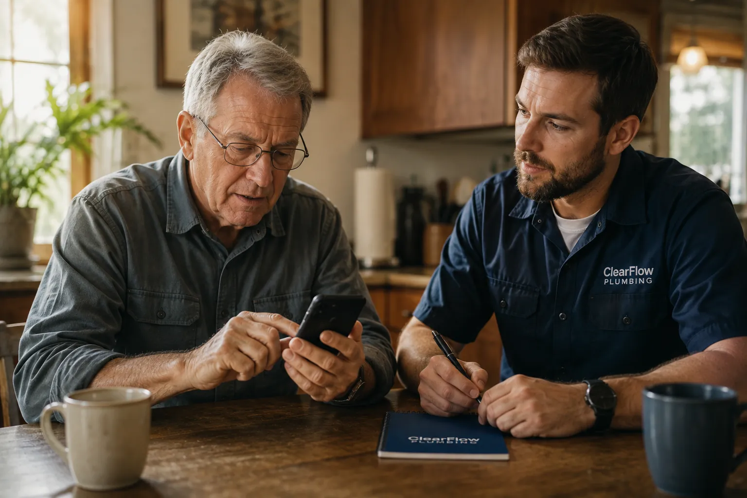
Here is the trap: you cannot see any of this by staring at your own page. You built it, you know where every button is, you literally cannot see it the way a stranger does in three cold seconds.
Two ways out. One, watch real behavior. Session recordings or a heatmap show you where thumbs stop and where people quit, and a week of that beats a month of guessing. Two, get a cold read. Hand the page to someone who fits your buyer and was not in the room when you built it, and watch them try to book without your help. Where they hesitate is your leak. Either way, the point is the same: stop auditing the page with the eyes of the person who made it.
The pattern behind all of it
Every one of these does the same thing. A mismatched headline, a slow load, a fussy form, a button nobody trusts, missing proof: each one makes a ready buyer do work to give you money. Targeting and ad copy earn the click. The page has one job, and that is to protect the momentum the click arrived with, because that momentum leaks in seconds and does not come back. The good news is that almost all of it is free to fix, once you know which one is actually the leak.
That is the blind spot CouncilAds was built to close. Before you spend a dollar of your budget, CouncilAds runs your ad, and the page behind it, past a council of 12 buyer personas, each modeled on real small business buyer psychology, from the price-sensitive skeptic to the ready-to-buy decision maker. They tell you whether the page keeps the promise the ad made, where a ready buyer would hesitate, and where they would give up and leave, so you can fix the page while it is still free to fix. On the math that matters: move a page from a 4 percent conversion rate to 8 percent and the same 500 clicks a month turn 20 leads into 40, on the exact same spend.
If you want more breakdowns like this, you can Add CouncilAds as a Google Preferred Source on Google at https://google.com/preferences/source?q=councilads.com. That way our Council Notes show up when you are searching for real answers about your ads.
The click is the expensive part. Do not lose it on a page that makes your best buyer work to buy from you. Find the real leak, fix it, and test the page before you fund the next click.
Ready to see whether your page keeps the promise your ad made, before you pay for a single click? Test your ad free at councilads.com.